Wednesday, May 01, 2013

Iron Man Three - Review


Vidit Bhargava


It came quite as a surprise to me to see the number of people who had come to watch the movie for a morning show on a bright summer morning, honestly this wasn't the case in 2010 when Iron Man 2 came out. Not many knew about the skills of Robert Downey Jr., even fewer knew that there would be a post credits scene as well. Time's changed. Downey Jr.'s skills are being praised all over. People who came to see the Iron Man, came partly to witness the phenomenon called Tony Stark as well & to witness how Robert performed, with ease the role of Iron Man. Surely, Iron Man was quite successful in building a franchise. But unfortunately, the franchise has only gone downhill from the first in the series.

The movie begins post Avenger's. The invisible guy here is facing anxiety issues, he's never been the same after the wormhole incident from Avengers. But lets continue with the review. There's destruction all around. Bombs, buildings and people everything just blows up. In the midst of all this, we are reminded of an incident that happened sometime ago. A bio-tech scientific discovery, an accident, enemies and a terrorist called Mandarin (Pandit Bhanji a.k.a Sir Ben Kingsley ), Its Iron Man's job to give everyone a nice little christmas present, honestly there's so much Christmas cheer in the movie that it seems a little awkward watching it in May. This should've been released on 25th December. The destruction, incredibly life threatening situation & mortal dangers at every turn of the street  all seems melo-dramatic, unnecessary & futile, given that everyone realizes that heroes aren't meant to die in a super hero movie. I was strongly reminded of Dan Brown who is in a habit of putting its actors in situation of extreme danger in just about every chapter of the novel.


But viewers have something better in store its in the form of Ben Kingsley and Guy Pearce both of them, a treat to watch. And obviously, Robert Downey Jr. and  is at his usual best. Together these three make this Dan Brownesque, Super Destructive Sci-Fi Thriller of sorts more watchable and provide a few genuinely fun moments which leave you with a good taste about the film which would otherwise have been a total disaster.  Don Cheadle who played the War Machine in Iron Man 2, is re-branded as Iron Patriot in the third installment, plays his role well. Jon Favreau also stars in a guest appearance in this movie, given that he had directed the first two, it probabibly isn't a bad idea to play body guard to Iron Man in the third installment. Talking of Iron Man, The Iron Man suit is as brilliant as it gets. The Mark 42 suit has a lot of surprises in store and again makes this movie so much more fun.

Stan Lee's appearance in this movie is quite hard to figure out. He comes and goes within 30 seconds. And you won't know its him unless you really are looking for it.

The character of Tony Stark: the billionaire former head of Stark Industries, is slowly iron casting itself into a Hollywood recreation of Elon Musk. Downey had spent a lot of time with Musk, before the start of the franchise, just to get a better shot at Tony Stark, Musk starred in Iron Man 2 and In Iron Man 3 we also see a mention of Stark wanting to do Spaceships and rockets before he went for weapons. Its not hard to draw parallels with Musk over here. Honestly, If Iron Man franchise continues even further, we'll either see Stark founding Tesla Motors or Musk getting into weapons manufacturing business or better still turning into Iron Man and revealing his identity on a tech-summit, All Things Digital would be the right place! :D


Watch it For the actors and specially Robert Downey Jr. but Unfortunately, Iron Man 3 neither has genius of the first part, nor the splendor of the second. Its some sort of a mashup of the first two. And ends up falling just short of the level of awesomeness you'd expect from the series.  Go with modest expectations and you won't be disappointed. I'll go with 3.5 / 5 for Iron Man 3. Its not as good as the previous two, but its not bad either.

Rating : *** 1/2

--
P.S. Wait for the post credits scene it changes the entire perspective of the movie. And if your theatre is as stupid as the one I went to, and doesn't show the post credits sequence, ask for the money back, or you could watch it on YouTube.

Saturday, April 27, 2013

Goodbye Google Search! A sad demise of User Experience


Vidit Bhargava
Step 1: Open Google Chrome
Step 2: Goto Start searching in address bar. Press Enter
Step 3: Look at the Results Page
GOOGLE INSTANT PREVIEWS? GONE!!! 
Step 4: Click on a few links, top results? They seem bogus. They are bogus, but you'll never know what they contain before you visit them.
Step 5: RETIRE IN RAGE and Start typing this blog post.

This is what I did in the last few minutes, when I went to Google to search for something. User Experience? Its been murdered and stamped upon at the 'new' Google Approach of cleaning.  One spring they just take out their brooms and strip google of tons of services. No matter how many people want to use it or like it or find it highly useful, if Google thinks its unpopular It is ready to pack its bags and off it goes. Recently Google shut down Google Reader, this caused a lot of public uproar. More recently, Google showed the door to Instant Previews, not much uproar, didn't even make it to the news but for a certain minority of people like me it has just ruined the search experience.

Here's what I use to do when Google had this nice little Instant Previews feature:
1. I would search for something.
2. Skim through the preview of every page,
3. And if I found it useful I would open the link.

Instant Previews have for long been a great tool to keep my computer away from Malware. If I would find a website of slightly suspicious nature in the preview, i would definitely not open it. But Now I am left with no other option but to guess.

What I am left with, now is:
1. I search for something.
2. Have to figure out the right page for me, by the website name or link.
3. Sometimes when in a hurry, i am looking for a blog post, i end up on a forums page.
4. I know longer feel like I am using a modern search engine. It looks as though i am using something from the 1990s.

Its disgusting to see that Google removed this. Its practically a 'The End' to whatever user experience was left on Google Search Results. I no longer feel like using it. I am thinking of shifting this blog to somewhere safer too, I might wake up one day to find that google has shut down Blogger because of 'low demand' or worse still, they might 'upgrade' it to one of their Ugly, unresourceful dynamic themes. GOODBYE GOOGLE SEARCH! I shall look for a better option soon.

Tuesday, January 22, 2013

The Curiously Boring Phone


Vidit Bhargava
If the tech blog headlines are to be believed, the state of the iPhone brand is thus:

iPhone 5 sales have been abysmally low! Yeah, 2 million pre-orders within hours, Hundreds standing in Lines to get their hands-on the gadget, A 45k product that’s priced 10k higher than its should be, is sold out within a week in a developing country like India and until this story was published, foxconn, sharp and LG were having a hard time catching up with its sales. YET the sales are so low that SHARP and LG have cut the iPhone Screen production to half and that’s apparently, no official word from Apple or SHARP or LG yet but it doesn’t stop tech bloggers to misunderstand a business based speculation by WSJ. How do these things happen to an Apple product and not any other product is quite hard to understand. 

Here’s a little info about how the iPhone stories come up. In the world of technology and blogging anyone with a close Apple contact (someone who is ready to give hints) can start a tech-blog claiming to be an Apple fanboy. Visit Cult of Mac, 9to5mac, Appleinsider and all such rumor mills whose daily task is to scoop out Apple’s plans of future products, etc. 

Now, its all very interesting until all the news is a speculation. It was a speculation that Apple would come up with a music player on 23rd October 2001. It was a speculation that Apple will come up with a phone in 2007 and It was a speculation that Apple will launch a tablet ‘mac’ on January 27th 2010. In all these cases the viewers got more than just a music player, phone or tablet. They’d always get more than what would be speculated, upgrades were all hush-hush so say a design upgrade to the iMac was as surprising as the launch of the iPod. But was the design upgrade to the iPhone in 2012 a mere speculation? Wasn’t iPhone 5 inevitable? Didn’t 9to5mac and others kill the excitement months before the iPhone launch by gathering all the parts, even going as far as to predict things down to what processor what speed and how would the actual interface look like? They did. And so did all the newspapers, tech-blogs and every one else. 

So everyone now looks up-to these websites for the Apple news. A misinformed rumor, a slightly complicated business report, a far fetched thought, the readers buy it all! And that’s when ‘people’ even start looking at iPhone as boring, as Apple failing (Almost everyone jumps on to that conclusion whenever Apple ‘stock’ falls slightly, just because the news booms everywhere within minutes and a lot of people misunderstand stocks and shares and go on to declare reports that Apple is failing) And that is how the iPhone sales are low RUMOR came up.

Now to the actual story of this short article. Its about the boring device called iPhone.
“So, iPhone is boring. Its got this same UI for the last three years, and the same Apps launcher ever since its launch in 2007. Its boring. Its boring. Its Boring. What’s interesting is widgets, adventures with Viruses! clunky heavy themes. Quad Core processors, GBs of RAM, We want More Cores, We want More RAM! Even if we don’t know what it does! Bigger is better. More is Better. Larger is prettier. That’s just 4”, People have ‘upgraded’ to 6.3” phones. That Lumia is more colorful! iPhone’s only black or White, more color is always cooler, its interesting! Why, Apple won’t do that. They did,  they’re just looking after market share now. The Apple that was, isn’t now! Maps! Oh My God! I’ll get lost in the woods and be beaten up by Centaurs and Trolls if I buy an iPhone, no I Love my life, i’ll instead donate it to the good cause of customizing my phone for ever!“

That’s the crass people speak or intend to anyway, when they have to defend their decision of buying an Android/ Windows Phone instead of the iPhone. Yes, all this makes partial sense when looked at superficially. After all haven’t we always compared gadgets buy their processors and RAMS? Well, here’s why I will always prefer an iPhone over Android or Windows Phones: 


  1. 10 Days after buying a phone, I don’t care about how it’s home screen looks, I don’t care which widget i’ve got to add today. On a busy monday morning, I’d rather jump straight into my email app and send that important mail. Or I’d rather just bring up the Notification center and check the stock update. I DON’T want to customize my phone, or play with its settings all day. I just want to get things done and quick (1).
  2. Android Phones are prone to viruses and malware. My old PC had viruses and I’d always install that disturbing anti-virus which hampered the productivity of that PC popping up whenever not required to. I don’t want the same to happen to my Phone. Its just a phone. Let it stay free from malware or viruses and most importantly “Anti” Viruses.
  3. Its a phone! Its supposed to fit into my hands properly. But perhaps most premium Android phones are too large. They either come at 4.8” , 5” or even 6”. To most larger-screen size means better, just because its a better way to watch multi-media content like videos. But for me, a phone ought to fit in my palms, I want to be able to use it to call my friends, not just watch videos or play games. And Content creation is still pathetic at 6” so it doesn’t matter if Its 4” or 6” , I’d rather buy that 9.7” inch tablet if i had other things to do like read books, create documents on the go.
  4. All phones are either too simple to be called smart (Windows Phone doesn’t even have a notification center or a native notes app) or are too complex to be called smart. (Android) After all I don’t want to run things like Task Manager, File Explorer on a phone or any device. Its the dirty job which I’d love to keep away from on any device, be it a phone or PC.
  5. The app experience in iPhone is far more fluid and intuitive than other devices like Android Phones or Windows Phones. But you may say, that Android and iOS apps are almost same! After all, Twitter on iOS is the same as Twitter on Android. But my point is, that you need far more power and there are far too many options to choose that right phone which offers a fluid UI without making me feel bad about buying it. No  thanks, I’d rather stick to easily choosing the boring iPhone which is still smart enough to run apps nicely.
  6. As a keep observer of design, the unnecessary metal strip, the inconvenient hardware design, the bulging camera lens, the unwanted battery ‘door’ or a wrongly placed sleep-wake button bother me very much. I’d like things clean, I don’t want a battery door! Or don’t wish to take extra care of my phone’s camera lens or don’t want it to keeping rocking on desk, just because its unstable because of a camera. The iPhone has a state of the art design, Its just right! it feels awesome to hold.
  7. Even if Apple Maps are quite bad, I’ve got alternatives. I’ve got alternatives for almost every native app which i don’t feel like using. Be it maps, reminders, weather, there’s an app for what’s not natively available and an alternative for the native apps. So there is no ‘-’ point yet.
  8. True, Apple’s approach to the OS is restricted. They ‘approve’ apps. As a developer, I can tell you exactly what stuff doesn’t end up on the store. Its the malware, the Apps that don’t do what the intend to, or apps that leek memory or slower your device, or the apps which are counter-productive providing unnecessary pop-ups etc. Its the stuff that I don’t want anyway. And as a user, I feel safer to download or buy an App from the store. True, the numbers would have been larger if the apps that were rejected were actually approved but then I wouldn’t buy an iPhone if they didn’t screen the apps before giving them to the consumer. Good Job Apple!
  9. It costs quite a lot. But then it lasts even longer. As an iPhone user, i can expect it to work well for at least three years. That’s a longer life-span than most phones. Also, given what I am getting at pushing a thousand bucks more to the seller, I am getting infinitely more. As a whole, its a good experience. I don’t have to sulk everyday just because my phone won’t do something that i desire.

    1. - Doing things quickly doesn't mean adding as many cores as possible into the processor or more RAM. when the software and hardware are integrated things can still be done very fast even if the processor is only dual core. So comparing a phone by its processor or RAM is a bad idea.

A short note on the term “boring” : iPhone’s design has been iconic. Partially the reason why so many phones want to look like an iPhone. Its simple and just clicks. Coca-Cola’s ‘iconic’ bottle design never gets boring, the iconic beetle design isn’t boring even though, the front has only been given minor tweaks ever since its launch! So iconic is not equal to boring. And iPhone’s Springboard UI and Hardware design is iconic. You know an iPhone from the circular home button, the rounded rectangle screen, its always going to stay charming and fresh.

So here it is. This why I prefer an iPhone more than Android or Windows Phones. But that doesn’t mean that any of you readers don’t have to buy an Android/ Windows Phones. If you guys, don’t mind these subtle things and would rather go for something more customizable and hackable. Go ahead, buy that shiny new Android Phone from the store. 

But Here’s how Apple’s condition is better than what it was in late 1980s and 1990s. Unlike Windows, Android cannot betamax Apple. Simple reason, the mobile market is governed by apps today. Developers can’t afford to stop making apps for iOS. That’s where they get their bread and butter from. Android can hardly provide a stable platform  for mobile purchases. So its only Android that’ll always live in the threat of being knocked off by a competitor. All these theories of Apple failing are nothing but mere speculations. Apple’s got a far more stable system this time. They’re dominance isn’t going to end so soon. Meanwhile, I’ll always enjoy the state-of-the-art productive, premium and boring iPhone!

P.S. You might think I am an Apple Fanboy, I am not. I just happen to like a few of Apple’s products and am open to accepting good competition. As a matter of fact, the new blackberry 10 is awesome. If there’s an OS that’s as simple and productive as iOS its gotta be Blackberry 10 OS. So don’t judge this as a fanboy article. :D

Sunday, January 13, 2013

Aaron Swartz & His contributions to Reddit

Vidit Bhargava
11th January 2013 was a really dark day for technology and web in general. Its a sad day for Web Development  Aaron Swartz is no more.


Swartz was a genius. At the age of 13, he won the ArsDigita Prize, a competition for young people who created "useful, educational, and collaborative" non-commercial Web sites. The prize included a trip to Massachusetts Institute of Technology (MIT) and meetings with Internet notables. How many 13 year olds would have dreamt of that? At 14 he was already collaborating with experts as a member of the working group that authored RSS 1.0. He also created web.py something that's extremely popular in the world of web development and available as an open source project. He was also an editor at Wikipedia. Aaron Swartz work doesn't stop here, he did a whole lot more in the world of internet and internet activism. I won't be talking about them today, some other day maybe. Meanwhile you could read his Wikipedia page.*

Lets start with Reddit. Reddit was founded by Alexis Ohanian and Steve Huffman. When I first read the news about Swartz' death, the headlines boomed "Reddit Founder commits suicide". I wondered why would either of Alexis and Steve commit suicide? Until I scrolled down and found the image of Aaron Swartz. Its a common mistake and even though the founders have often noted that Aaron Swartz just moved over to Reddit after it merged with Infogami (A start-up by Aaron Swartz) this doesn't stop the websites to stop reporting that Swartz was a co-founder of Reddit. Its good to highlight the good work (in this case great work) done by a person but it doesn't make sense to wrongly attribute some work to him. True, Reddit is what it is today because of Swartz. It ran on a technology developed by him for a long time but he didn't co-found it. So please stop spreading 'wrong' information about him. Let people remember him for who he was and not what he never did. A special request to popular newspapers like Guardian and WSJ. [image on left]


Reddit comment by spez [Steve Huffman]

Here's remembering the genius for what he was. His work on the RSS, his work architecting the Creative Commons License, Web.py, Open Library, his great work in the field of internet activism and his contributions to Reddit have immortalized him in the world of web development  and as those creative commons stickers stick out on our websites lets add another one, saying "Thank You! Aaron Swartz", this one's for all he gave us and the world wide web.

* - The Wikipedia pages are all a part of the creative commons licence, co-architected by Aaron Swartz. A part of this post was deliberately copied from Wikipedia  paying homage to one of its best editors and the guy who let us copy all this 'legally'. Only asking for a bit of credit to its real source.

Tuesday, January 08, 2013

5 Inch is so commonplace


Vidit Bhargava


So we’re in that part of the year when we see large crowds gathering in Las Vegas for watching a Consumer Electronics Show take place and even more people watch it online via Liveblogs, twitter updates, tech-blogs, etc. CES is one big event, even if it has turned out to be a no-show in the last few years, as the attention has shifted to other larger events like E3 and Mobile World Congress where the mobile manufacturers are more likely to come up with Flagship phones. But CES has its share of phones too. And 2013 is proving out to be the year of 5inch phones.

“5 inch phones? They are so commonplace, everyone makes them! What’s new? Do you  know what’s better than a 5 inch phone? A 6inch phone, that’s right!”

I bet this is what goes through the manufacturer's brains when the make phones these days. Sony, Huawei and Vizio have already gone on to announce their 5 inch screen phones at CES. Samsung has been making them for an year and a half and all others are readying their 5 inch screen phones for a Q1 launch. 

However senseless the idea may seem but 5” inches is just too large to be called a phone. And there exists no such mid-range called a “Phablet” where it becomes almost humorous to see people pulling these gigantic touch-screens to their ears for listening a phone. Years ago, when Dell came out with its own 5inch smart phone it was ridiculed for its awkward design. People have found a way round this though, they’ve reduced the bezel size, the phones have come up with these awkward shapes just to fit something as large as a 5” inch screen in your palms, it still doesn’t but it has hit the markets surely.

This year companies aren’t stopping at just 5inches. They’re ready with their 6inch phones too. 5inch phones too commonplace? Looks like. The competition is for the largest possible screen in your palm I suppose. 

But if we look at the whole system of pricing these phones, its becoming increasingly absurd. The low end phones that cost between Rs.15-20k are the ones which feature a 3.7-4.0” screen. The Mid Range features 4.0-4.7” screens they cost Rs.20-30k, the high end phones with their extra large 5.0 ‘or’ 5.5 or even 6” cost between Rs.30-35k. Yes! We’ve gone screen size crazy again. This is the sort of things that happened to TVs but its happening to phones as well. And it makes no sense at all.

Here’s why it doesn’t make sense to price phones by the screen size:
  1. Phones are meant to fit in your palms. Larger screens never meant the former statement would hold true.
  2. Even though big screens cost more and those phones need to be priced high but that doesn’t make phones with smaller screens low end. Pricing them low and providing them with old hardware is saying, “You may want to use these but buy our 5” inch phone, its larger and its better” Dumber too.

Here’s what the mobile manufacturers apparently think when they make these phones:
  1. “The iPhone has a 4” inch display. Lets dwarf it, lets make 4” inch the new low end. This way buyers will see it as a low-end phone only.”, absurd as it may seem but the truth is some people think this way too only to say that they thought out of the box.
  2. “Larger Screens mean more usability space, with a large screen you’ll definitely be able to use those content creation apps better.” - Thanks! but NO. I’d rather have a tablet than buy an awkwardly sized phone which doesn’t even make sense to hold it to the ear.

Here’s a quick look at a few recent and upcoming 5 or 6 inch phones which end up to be larger than necessary some of them announced at CES 2013:

Huawei Ascend Mate - 6.1inches screen. The phone was announced at CES 2013, surely no one needs a tablet now. Do they?

Sony Xperia Z - Sony isn’t far behind when it comes to following the herd. This ‘premium’ 5 inch screen phone has a glass back too.


Vizio is a lesser known company. This is their bite at limelight. A gigantic 5” screen phone bound towards China.


Here’s summarizing my stand on ‘large’ phones:
  1. They aren’t meant for me or any human with an average palm size.
  2. They look funny when someone picks them up to answer a call.
  3. Na’vi’s will love it maybe
  4. Extra large phones aren’t smart. They are dumb!
  5. 6 inch phones? No thanks, I’ll save my money for a mini-tablet rather.
  6. I’m more than happy with a 3.7 or 4.0” screen size form factor.

P.S. Here’s another phone from the 5” inch line of phones. Yes, i am not kidding its a phone! :)

* Image Credit: The Verge

Sunday, October 07, 2012

BLUNDERS - A Request to Hindustan Times

Vidit Bhargava

Hindustan Times was recently crowned the most read Newspaper in India. Perhaps its the most read. Perhaps its got many brilliant writers, but throughout the year, I've seen a few massive blunders from the most read Newspaper of all time. Some of them, are misleading Headlines. Some of them are serious factual mistakes, others are mistakes that cannot be forgiven.

I can remember three major blunders that the Hindustan Times Made Most Recently. I'd Like to highlight them here:

23rd September 2012: A Rather funny mistake. Looks like the writers were half asleep, or this section was handed to someone who hadn't watched cricket in his life.
Just Goto the Sports Page on 23rd September 2012. 

10th July 2012: A rather small piece of mistaken journalism or misleading headlines. The Date is 10th July 2012. The Headline: Apple Releases Mac OS X Mountain Lion, which is misleading because the OS X Mountain Lion didn't come out before 25th July. However, the content explains it was a Gold Master release for Developers. Forgivable Yes. But, Nonetheless a Fast class example of Misleading Headlines. Targeted to Attract Visitors.


1st July 2012: This is rather a matter of national disgrace. HT Brunch the Magazine Hindustan Times gives out to its readers reports. The Year, of the 26/11 Mumbai attacks is mentioned to be 2006. What does one do with such journalists?

Official Link (the Official isuu account of HT Brunch) : http://issuu.com/brunch/docs/brunch-01-july-2012 - The news is on Page 8 of 24. 

A Sincere Request to Hindustan Times. You guys are the most read Newspaper in India. You shape country's opinion. Such blunders just mislead/ misguide and perhaps anger the audience too. 


P.S. Perhaps I've made a few grammatical errors in making this post. Forgive Me.

Thursday, August 16, 2012

OSX Mountain Lion Review

Vidit Bhargava


Software: OS X Mountain Lion
Device Tested on: MacBook Air (June 2012)

10 Minutes of using OSX Mountain Lion and you'll realize that it's the 200+ tiny invisible new features that are making your experience so lovable and not just the 10-12 new things that have been advertised.

OS X Mountain Lion is an extension of what Lion was. It's a sequel to the previous OS which introduced various iOS elements like the Launchpad, and new management tools like Mission Control. Mountain Lion betters that experience and adds a few more iOS elements in the decade old OS X which just gets better after every software update.

Among the little things that have been improved in OS X are the multitouch gestures and the overall scrolling experience. There's a simple intuitive gesture from almost every task you'd be performing. You can tap with three fingers to launch a quick preview of any file in the finder. A pinch inwards with your thumb launches the Launchpad and a pinch outwards cleans everything up and you get a clear view of your desktop. OS X maintains its love for gestures and they just get better by the day.

Notice the Search bar at the top, its just brilliant!

Launchpad is easily the quickest way to get to your applications in OS X but it can get tiresome sometimes, to navigate pages of applications only to find something essential. Come OS X Mountain Lion,  the problem is ingeniously solved. Perched at the top of application icons is a search bar which activates as soon as you start typing with Launchpad open. Doesn't look anything awesome, isn't it? But it does make app launching significantly faster and is one of the neatest improvements you'll see in an OS (These things just get ignored most of the time.). Launchpad is something we saw in OS X Lion too but it gets more meaningful with Mountain Lion.

iCloud Integration with iWork: At the time of its launch the iCloud was criticized for its Mac implementation. It was clearly obvious that iWork would get an iOS like document browser for iCloud documents and people were really disappointed when it didn't come at its launch in October 2011. Well, it has come now. And it's a blessing! You can save / open files from your iCloud Documents and access them on almost any iOS device you own (Will need iOS 5 or later) and all your mountain lion macs. It's clearly a win-win situation for those who own multiple Macs or iOS devices.

Gatekeeper: It's a tool that gives you the power to pulldown a shutter on any outside apps and converts your Mac into a closely guarded walled fortress. You can then download applications from the Mac App Store only or choose an option to download apps that have are signed with a genuine developer ID. This is quite a disappointment. The Mac App Store doesn't have a really good selection of apps to choose from and the sandboxing of applications is still taking a little time, even though most developers have done that. It's better to keep the gates open for now.

Apart from these little additions, almost everything has undergone changes which improve the user experience and provide more functionality in most cases.

Apple's update to the new OS is more productive at many fronts. For Example, you get all your Mails, tweet replies, news updates, reminders and very soon, Facebook notifications on the notification center, as soon as you switch on your Mac. The great part is that all you need to do is a simple two finger swipe from the edge of your track pad to reveal the notification center. A Notification Center on any device is extremely helpful. At times I find my self 'switching on' the computer only to check for mail and news updates and i end up doing all kinds of un-productive work most of the times, but having a notification center really helps curbing that to a great extent. The only thing that bothers me here sometimes is the lack of weather and stocks widget in the Notification Center. Both the iPad and Mac lack them. But these widgets on the iPhone are extremely helpful and it's a disappointment not to have them on the OSX.

There are things Apple has done to build a stronger Eco-system between iPhones, iPads and Macs, With this update. Some of them are very powerful (iClouds Documents and Data) others like Reminders and messages are cool additions but I can hardly find any common uses of them when using a laptop, compared to using a phone. I'd rather have my self notified on a phone about my grocery shopping every time I'm near the grocery store than be reminded on the move on a Mac when in all probability I'll be doing some extremely urgent or important work (hence even using it on the go).  But it works just about fine the other way around, say I set up reminders to take certain things or drop a package to my friend, on a mac. I can then receive notifications on my iPhone and iPad whichever device I have. The restriction of course is that you need to be a part of the eco-system. And to do that you must have at least two iOS/ Mac devices.


The other ecosystem loving app is the Messages application app that comes as a replacement to the old iChat. Messages maintains a good balance between your IM chats and the others that you do with your friends having iOS / Mac Devices. Its just ideal for Mac-Mac conversations. And  There are many more uses of such an app, including the fact that you are actually receiving chat notifications as soon as you are on your computer. Moreover messages could benefit in the future with a PC app to. That'll then create a definitely powerful and successful chat client for communications between computers (something like an SMS service for a computer). But that seems to be a far fetched dream for now.


There is also the notes application which is quite snappy when referring or creating quick notes but handles image formatting quite badly. Notes also lacks options to attach audio or video to the notes and has a very premature image embedding option. In short Notes is behind a lot of competition when we look at how others like Evernote provide such features but in simplicity Notes for OSX beats all other apps including Evernote. There is no immediate revolutionary use of this app but it's not bad to have something like this.

Sharing is big in OSX Mountain Lion. You can share links, photos and videos on the two biggest social networks Facebook and Twitter (and of-course Seina Weibo too) and you can also upload photos and video to Flickr and Vimeo. You can just about share anything from any where. A single swipe to the notification center brings up the share via tweet option (and will soon have share via Facebook too), everywhere else you'll either find a share button or will have a share option. Everyone's on a social network these days. And sharing options make it easier to be more active on them and a good implementation just makes the experience more snappier.


Safari's Offline Reading lists and the new tab view are little gems. The unified search and address bar was inevitable, but the reader icon that stays there at all times even when there isn't Anything to "read" is a bit irksome and feels a little out of place at sometimes. Safari feels quite fast on OSX and hence gains a lot more audience than chrome (running on a similar engine) ends up getting.

The New Tabbed Browsing loves the trackpad but has a strong aversion to the 'mouse'.

Safari's Reader Button, stays there, even when there is nothing to read.

Dictation on OSX is quite average, it's hardly able to recognize the Indian accent without making mistakes. But Having said that dictation on OSX ranks among the best speech to text tools available in the market. Dictation actually gets better over the time, it learns how you pronounce certain words, it gathers the speech data to do this. In our tests speaking in an Indian accent, Dictation showed only 44% accuracy but when tested on American accent the accuracy was pretty good. We may just be a step away from Siri on Macs. And that, would be amazing.


And the last thing that makes this OSX experience filled with sublime awesomeness is the AirPlay compatibility, with AirPlay built-in you can now listen to audio on your AirPlay speakers from any source not just iTunes or QuickTime. This is a really going to be helpful for those who've got either an AirPlay enabled TV or speakers, it makes the experience of using Airplay much better.

The dock Is an area of concern On OSX Mountain Lion. They've now put a grayish, more opaque than translucent dock with tiny lights that indicate whether an app is running or not. Compare that to the dock in OSX Lion or Snow Leopard and you realize how bad it is, it's not the grey color thats so appalling but the tiny lights which leave you with a sour feeling.


The Battery Life on the MacBook Air that I tested was quite appreciable and was quite unaffected by the upgrade. It runs a respectable 6.5 hours during heavy app Development hours and crosses the 7 hour quote sometimes, when you're just doing casual browsing or chatting on Messages. My tests on the software end seem satisfactory their doesn't seem to be any drastic change in the battery life ever since the MacBook Air was upgraded to mountain lion.

Summarizing the OSX experience, Apple's OSX Mountain Lion is a "massive upgrade" and perhaps the first truly social operating system. Having said that we're still in the OS 'X' era, and Mountain Lion maintains all traits of a typical OS X update and not something completely new. OSX is lovable to use and there aren't many glitches. It's perhaps the best update to OS X ever since Leopard. It's super cheap at just $19.99 and it'll be unwise not to upgrade your OS.


Rating: 9.1/10

Tuesday, July 03, 2012

Podcasts App: Quick Review


Vidit Bhargava
Skeuomorphism is at its best when it generates a neat and interactive experience between the user and the touch device. Apple has recently implemented Skeuomorphic Design very  deeply in most of its Applications, be it the Contacts App on the iPad or the iBooks Application for iOS. Its struck the right chord many times but has also gone overboard with the idea quite a few times. Podcasts for iOS falls somewhere in between.

Just a few days back Apple quietly rolled out a Podcasts application for iOS Devices. The application appreciated by many puts the wide range of podcasts on the iTunes Store into a live streaming application which more-or-less works like a radio of sorts. Apart from that, the Podcasts discovery is also very easy. With a “Popular Stations” Tab on the home Screen you can easily browse through the best in All Categories of Podcasts. And Listen to a Live Stream or Download by the tap of a button. Its a perfect utility for those looking for a quick and snappy news read, or a casual listening to the favorite podcasts.

But What Holds back this app, is its “Now Playing UI”, Its over-flooded with Skeuomorphic elements like a retro style high-speed scrubber, or crammed together square play, rewind and forward buttons. This UI turns out to be so sluggish sometimes that I end up closing the app. Scrubbing is the worst part. The experience is worse on the iPhone / iPod and ever more irritating on an A4 Device. They could have easily gone with the old Music app UI which is quite neat or gone with the new Music Layout, the one that’s coming out with iOS6. Both of them are much better than the Podcasts’ app.

The Podcasts app can indeed do a spin-around for Podcasts, with this update But only if they get some key UI Elements right.

Rating: 3/5

Friday, June 22, 2012

How Apple Passbook Works

Vidit Bhargava
Apple released their latest iteration of iOS, last week at the WWDC 2012. Amongst many enhancements (which included a completely new vector based maps tool too) the announcement of a new inbuilt app called Passbook was slightly side lined. What exactly is Passbook? Or How is it going to change our Wallets?

Passbook is a pre-installed iOS 6 Application which will let you view your digital gift cards, coupons, boarding passes, shopping cards, etc. You can then use them instead of their offline counterparts.

Say you book a travel ticket, and receive an online boarding pass via email. Now at the airport you’ll have to search through your emails for that boarding pass and then get it scanned. Apple simplifies this task with the Passbook tool. The Airlines can create a Passbook based boarding pass and share it to you via email, which you can then open in your passbook application. Once in the passbook app, your new digital boarding pass will be updated real time. Also when you are near to the airport a push notification will come up at your lock screen, through which you can instantly access the pass!

Passbook can also store your movie, sports tickets, gift cards, store cards or whatever that qualifies as a coupon, pass or ticket.

Here’s how it works: The developer creates a passbook pass using Apple’s Pass-Kit API and then shares it to the user via Email, URLs or an iPhone App. The User then opens up the pass (ticket, coupon or card) on his phone, which takes him to the Passbook app and the pass is stored. Now the user can get push notifications for his pass. (For Example, if a certain store whose store card is in your passbook is near by, a notification will come up on your phone telling you that a certain store is in the vicinity, you can then open it to use it, as you enter the store)

Passbook is sure to provide a very productive future to the iOS Users. Almost certainly the weight of wallet is going to drop a bit, as you get rid of all those membership cards and gift coupons and instead store them on your phone.

But Passbook is a little far from perfect. There is a certain lack of availability of advanced 2D Bar Code Readers at many places. Currently Passbook Passes are restricted to embedding 2D or QR Bar Codes only, this is going to demand inputs from the companies to install the new and more expensive 2D Code Scanners at their shops. Here Developers might have to step in, by providing necessary hardware for many of their clients. The same is going to be a problem with many other countries all over the world. So if major outlets are willing to provide these services, they’ll need to actually have proper hardware first.

The success of the Passbook depends on how companies take steps to utilize it and how fast they install the necessary hardware. With Passbook Apple is not trying to digitalize your wallet but its creating a tool for online Passes. Much like what Adobe Reader is to PDF files, Passbook is to Digital Passes (only those created via Apple’s Pass-kit!)

Wednesday, June 20, 2012

Microsoft Surface First Impressions

Vidit Bhargava


Filled with gloss, covers, lights and music, Microsoft Surface made an appearance in a pressure sensitive magnetic cover’s ad today. Or was it the other way round? Well at least that’s what I felt when i first saw the Microsoft Surface Teaser Video. It’s evident that they are stressing on a part of the tablet which is neither unique nor uniquely designed. And since one generally tries to highlight the best of a device in his video, we may safely presume that this is the best they can offer us.

So, lets start with this new pressure sensitive keyboard attached to a smart cover like polyurethane (or a similar substance) ‘cover’. At first glance this pressure sensitive keyboard cum smart cover looks amazing. Some way even think that it’ll be their best typing experience on any device. But the final product may just act opposite to what you think its going to be. Microsoft’s protective cover is a razor thin keyboard. It’s razor thin and its flat. Which means, that it is more than likely that you’ll get a sprain in your hands than type comfortably for hours. This thing is quite ergonomically unfit. Moreover, you are going to need to touch the screen for any assistance while typing. And using multitouch on any screen which is perpendicular to your hands is a cumbersome experience. That’s the  ergonomic issue number 2. The third and the final issue which comes when you try to use this cover is the option to use it as a laptop and start using a track pad. Windows 8 is a dual minded software. It wants to be in your tablet as well as at your desk. History tells us, that its a bad idea. Microsoft itself has created and failed at this task. They’re trying again. My experiences with Windows 8 so far, tell me that its going to be a uphill task to actually stay at one UI and work efficiently. You can’t use the old UI efficiently with a Tablet and there aren’t many apps for Metro UI on the Windows Marketplace / Store.


In terms of hardware, Surface provides just about what all other tablets do. Its got a Tegra 3 Processor and 32GB and 64GB of Storage options + an SD Card Slot. There is also a USB Port which is a slight stroke of brilliance, since it may allow you to use your controllers and keyboard and mouse and everything and convert it into a notebook, if you get too annoyed with the touch experience or want a slightly better gaming experience. But then its just one USB Port and games that run on traditional PCs might not run on Windows 8 RT tablets. Also unlike as advertised, charging your phone on a tablet might not be the best idea if its own battery life is short (Microsoft is still to give a word on battery life). While the Magnesium casing is new and on first impressions looks sturdy, The back of the tablet is particularly uninteresting and slightly clumsy on design. There is a “Stand” that you can kick to put it at a good angle for watching movies, which is a good tool (only if its strong enough to not keep flapping every-time we hold our tablet), but it seriously harms the over all feel of the device since now you are left with a very bad looking back, with screws and stands all over. The tablet is just as thin as the new iPad (9.3 mm) and it weighs about 603 grams. A lot depends on how this hardware will eventually perform.


Surface runs on Windows 8. Windows 8 RT to be precise. While its a nice experience with the metro UI placed on the screen, its not going to be as good when you try to run some of the old UI software. Its going to be a little annoying. Having said that, there are a lot of pre-installed apps on the Metro UI too, and they look beautiful. Since I haven’t used the tablet my self I might not be able to tell you exactly how good or bad it is. (My experience with Windows 8 on a laptop was quite miserable)

The Microsoft Store however, is  yet to take any flight and with Microsoft’s ultra-strict app approval policies, tedious development standards and slightly inferior SDK and APIs its going to be tough to lure new developers to create apps solely for Windows 8. As of now iOS remains their preferred choice.

Well that’s pretty much it about the Microsoft Surface. We don’t have any pricing details or launch dates or even battery life quotes. All we have is a promo promoting the Touch Type Cover.

Microsoft Surface will have quite a task at eliminating internal competition with other tablet developers who are creating Windows 8 Tablets. Of what we have seen today at the unveiling the Microsoft Surface is not even close to be in competition with the iPad. The iPad sits firmly at the top with a well grounded operating system which is in its sixth edition and a huge developer database, Something which all other tablet Operating Systems lack.  Also Its got a massive head-start and Apple has so-far only improved the Tablet experience per upgrade. Which has left no-room for the aping competitors to step in. Surface is hardly a killer to the iPad.


Having said all that, we are still to get our hands on a Microsoft Surface Device, and it isn’t coming before Fall (That’s when Windows 8 is likely to be unveiled for Consumers), till then its hard to say if its going to be a success or not. I have given my impressions on the Tablet, the numbers will do the talking now.

And Did I forget to mention that there is going to be a second variant of this tablet, too. Its going to be called Surface Pro. They are adding an Ivy Bridge Quad Core i5 Processor into it, A USB 3.0 Port and a Mini-Display Port into it. There is also going to be a stylus for that tablet. And its going to be heavier and thicker. And it’ll have Windows 8 Pro (These names still remind of the prank Jobs played at them, at the launch of OS X Leopard)


P.S. I may have been  a little harsh at Microsoft Sometimes but seriously the first impressions were taken without being affected by previous experience with the Software Firm.

Friday, June 01, 2012

Being First. Does it Matter?


Vidit Bhargava
What was the world's first smartphone? The world's first camera on phone? Who was the first to come up with touch-screen technology? Who invented the light-bulb? The answers to these questions might be too trivial for you to remember. But are they important? Do you really need to care about the first in businesS? Or is it the best you want?

People and companies sometimes screw themselves by selecting a really new technology for their new gadget. Evidently they want the newest and best for their gadget. The tech-world is as it is highly competitive. Also the silicon valley giants are always under threat of some passionate Stanford or Harvard Grad who'd ace them with his new upbeat ideas. Its a cut throat battle out there and coming first, getting a patent and pushing some crazy new technology into your next gadget is sure to get a lot of attention.

But what most people overlook is the fact that being first doesn't mean that it is the best. Technology, like a life form, evolves. If you try to use it before it's mature enough to be used, you will end up with a buggy gadget that never works and no one likes. But if you wait for it to evolve, you perfect it, and then harness its technology into creating something powerful and economical, you might come up with something better that'll change the world around you.

The history of the light-bulb (much in question these days, due to Oatmeal's apotheosis of Tesla) has a lot for us to learn. It is clear that Thomas Elva Edison never came up with the first light-bulb. The first we saw something of the sort of an incadenscent bulb was when Humphery Davy created first incandescent light by passing the current through a thin strip of platinum in 1802. But then that's not how we use the light bulb in our homes, do we? Edison was the first to create a bulb which was feasable for public use. It was something that wasn't expensive nor harmful. It was the best of the many light-bulbs invented before and after his version. He became successful and trumped over the 22 inventors of light-bulb before him. Today he's widely known as the inventor of the light bulb (even though there were people before him). That's the classic example of how the best technology is the one which is evolved enough to be in a product and is feasible for the consumers. Had we all been delivered Humphery Davy's Incadencent light, well.. the future would have been darker than one could imagine.

Inventing new technology is just half the work done. Successfully implementing it into a fine product is what matters.

Thursday, April 12, 2012

Kahaani Review


Movie: Kahaani
Director: Sujoy Ghosh
Story: Sujoy Ghosh, Advaita Kala
Actors: Saswata Chatterjee, Vidya Balan and Parambrata Chatterjee

Review By: Vidit Bhargava

There was hardly a moment when the audience gazed down on their cell-phones to chat with their friends in this 2 Hour movie about a woman finding her missing husband, who doesn't seem to exist. At first, this Sujoy Ghosh directed thriller may be ignored as a yet another attempt to fix in some exotic disease on our protagonist and present it to the audience in a new look. Clearly we've had enough of that non-sense. But Kahaani is a completely different thriller, with a tightly woven script and brilliantly written characters.

Even though, Kahaani has been advertised as a thriller, our characters are not put into unnecessary mortal peril or being kidnapped and being ported to different continents. This being reminiscent of most modern day thrillers, be it books or movies. Kahaani provides thrills quite differently. There is that uncanny touch to it, that puts you on the edge of your seat, thinking of what will happen next. All this is done with a very subtle backdrop and some good background music, which makes you feel as if you were along side the main leads solving the mystery.


There is little to disclose about the plot here, there are many twists and turns which are served to you during the course of this two hour thriller. The story revolves around a pregnant Vidya Bagchi (Played by Vidya Balan) who has arrived in India in search for her missing husband. But the problem is, that there are no records about the fellow at all. What follows next is Vidya's pursuit in find her missing husband, filled with appropriate twists and turns.

The Plot is original, but it is slightly inspired by popular literature like the Dan Brown thrillers. You'll find a few ideas taken from the 'Dan Brown Thriller Stencil' in this movie. There is a gruesome prologue, seemingly unconnected to the plot of the film, A hit-man answering to a unknown caller and executing murders by the confirmation of an MMS. There even is a subtle epilogue fixed into the movie. But truth be told, Sujoy Ghosh has created a thriller which is much better than Dan Brown's attempts using similar tools.

Also the screen play is slightly inspired from Satyajit Ray's mysteries. The scene about running hot-water and Vidya Balan Opening the Windows of her room and sitting on the sill to see the city-scape are an ode to Satyajit Ray. But the director never lifted stuff directly from the books. In-direct references are only a tribute to the famous director. 

Acting is top-notch. Parambrata Chatterjee As Satyaki is phenomenal. Nawazuddin Siddiqui over does a little as the curt Intelligence Officer but is fine most of the time. The scene where his bellowing at Vidya Balan suddenly changes to a polite 'plea' was done with great poise. Vidya Balan is on a roll, this is probably her best performance we've seen in years. Moreover her character was written brilliantly, keeping any question of a weak performance at bay.


One of the key elements of a good thriller is to create an element of shock and surprise at the end i.e. the point where the mystery unfolds. Sujoy Ghosh, does it quite nicely and puts the audience into a complete silence. Of course the effects on audience may vary from place to place, you may hear a sudden gasp, a loud whistle, some praises or even claps. Trust me, The mystery is that good, no one seems to have complained so far. I heard from lots of people about the movie, and all of them were spell-bound about the climax, they said it was one of the best they've seen in a thriller. Personally, I think that the climax was great but it could have been done with much more intensity and could have created a bigger impact. People sometimes go to a Hindi thriller with toned down expectations about its mystery but Kahaani is not a 'Kahaani' to be Underestimated. But all is not so good about the film, even though the mystery is more or less brilliant, it does leave a loop-hole or two, which leaves you slightly disappointed.


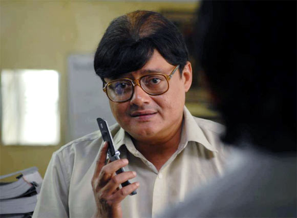
Anyone who has seen 'Kahaani' would really be dead scared of these words, "Namoshkar!... Main Bob Biswas. Ek Minute". Bob Biswas is easily the best hit man ever created in a Hindi Movie. Played by the talented Saswata Chatterjee, Biswas is an LIC Agent in the mornings, and a brutal Assassin after work hours. The character of Bob Biswas is exceptionally well written. The dual nature of Bob is what makes him so dangerous. He may look like a local Bengali, an every day working man with a job at one of the 'Daftars' with a tinge of charm. His polite demeanor, carefully masks his true blood and makes him look totally Harmless. Moreover, he doesn't even look like a Hit-Man, he is in his mid-ages, slightly overweight, gets tired easily and might not be the ideal choice incase of a quick escape. But that is hardly needed, since Biswas, is an Assassin of the first order, he completes his task without so much as a hint of suspicion on him. In a sequence in the film, Vidya Balan is thrown towards a speeding Kolkata Metro by our Assassin Bob Biswas , only pulled back in time to be politely asked to go away. The fear that creeps Vidya Balan and the audience is quite genuine. Bob Biswas, is a truly inspirational character. And Saswata Chatterjee pulls it off with great ease. I am sure, we'll be seeing more of him, in the near future.

Kahaani is an entertaining thriller which requires your grey-cells to be in great form. It's a blink and miss movie, you just can't move from your seats while watching the movie. It's certainty the best Hindi movie in 2012 so far and will be ranked amongst the classics in time to come. Also, the movie has a replay ability, even though most of the movie depends on a mystery. You'll still enjoy it because of its calm backdrop and awesome performances.


Rating: *** 1/2 /5 (Amazing)

Tuesday, April 10, 2012

There is a reason It's Developers Only

Vidit Bhargava
Yesterday I was reading a blog post on the internet, it was talking about how early Mountain Lion users were facing issues and how the same would not have been in Steve Jobs’ era. Hardly anything different from What Apple critics would say, but it left me to ponder on something. Why do people download Developer Previews when they aren’t developers?
Of course there is a reason why developer only previews are released, they are meant for developers who want to make their apps compatible to new standards, evaluate or suggest changes which will eventually help their firms make their product better and provide ‘users’ the best experience.
Quite certainly developer previews have some glitches, errors and aren’t fit for consumers at all. There isn’t any problem with that. Obviously That’s why they are developer only, so that developers can help software companies iron out any kinks in the software, to make them bug free and more secure before the final product comes out.
The problem arises when every kid with a tech blog and access to torrents downloads these previews and berets the software for having glitches, which puts forward a negative image of the software. Why peep into the kitchen while the food is being made?
Part of this Problem is the extensive media coverage a developer preview gets. Just minutes after the arrival of a new operating system’s Developer preview, the world of tech news is filled with In-Depth Previews of the developer preview. That is bound to make users excited to download the preview and try it themselves.
Using a developer preview can be disastrous for the end-user. Me being a developer myself downloaded a developer preview of Windows 8 a few months back to help myself with web-app Development, while the preview helped me test my HTML5 apps on the New operating system, it also posed problems beyond my reach! For example the frequent blue-screen of death while shutting down was a major issue and I was hardly able to debug it from my end. Eventually I had to give up the idea of using a developer preview and use my good old Windows 7 instead. The same happened while using early builds of the iOS5, though the problems were more controlled then and there weren’t many crashes and it was a more productive outing, which helped my app Development team to be on track with the latest operating system and the latest frameworks, but A few really irritating software issues were imminent even in the later stages of the Beta Program.
Summing it up I’d like to say, Developer previews are not for download unless you are actually a developer and not some techblogging teen geek.